Titled
An Homage to Title Design
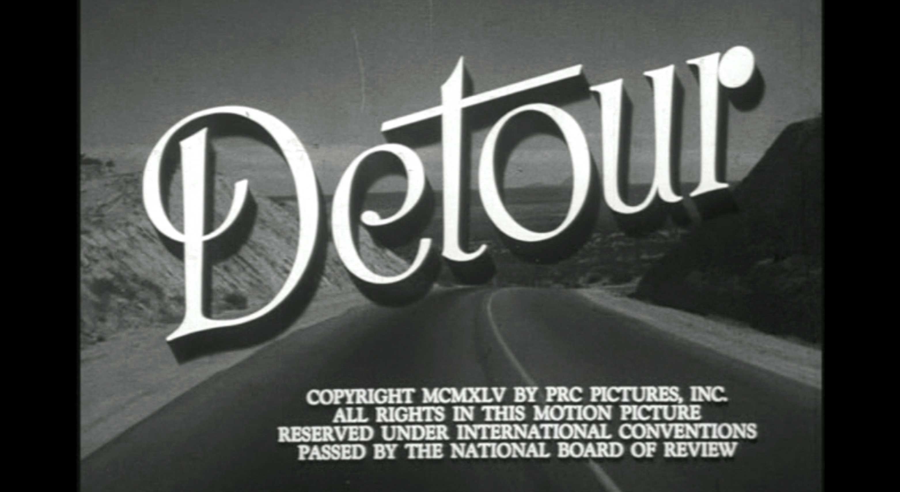
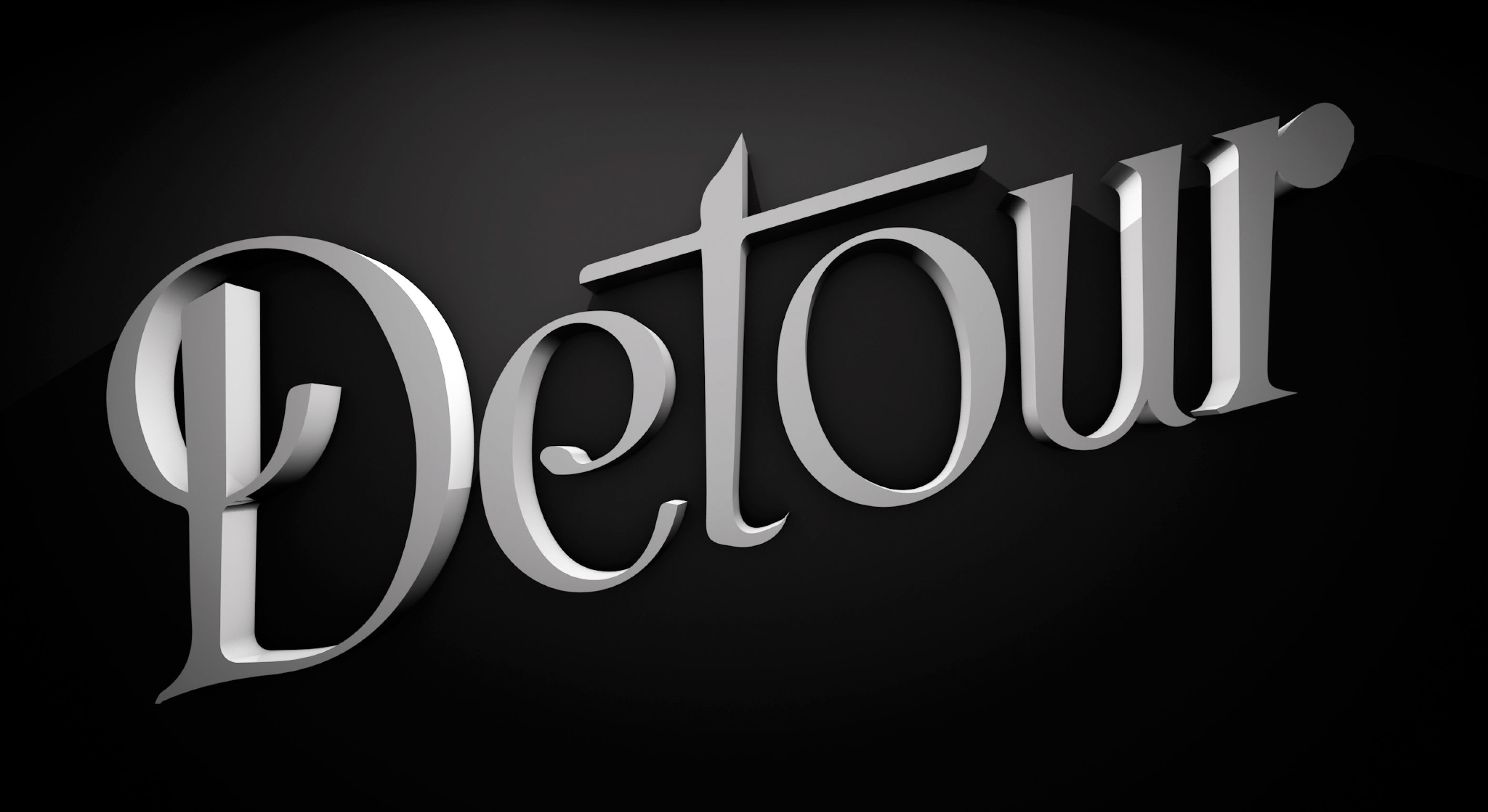
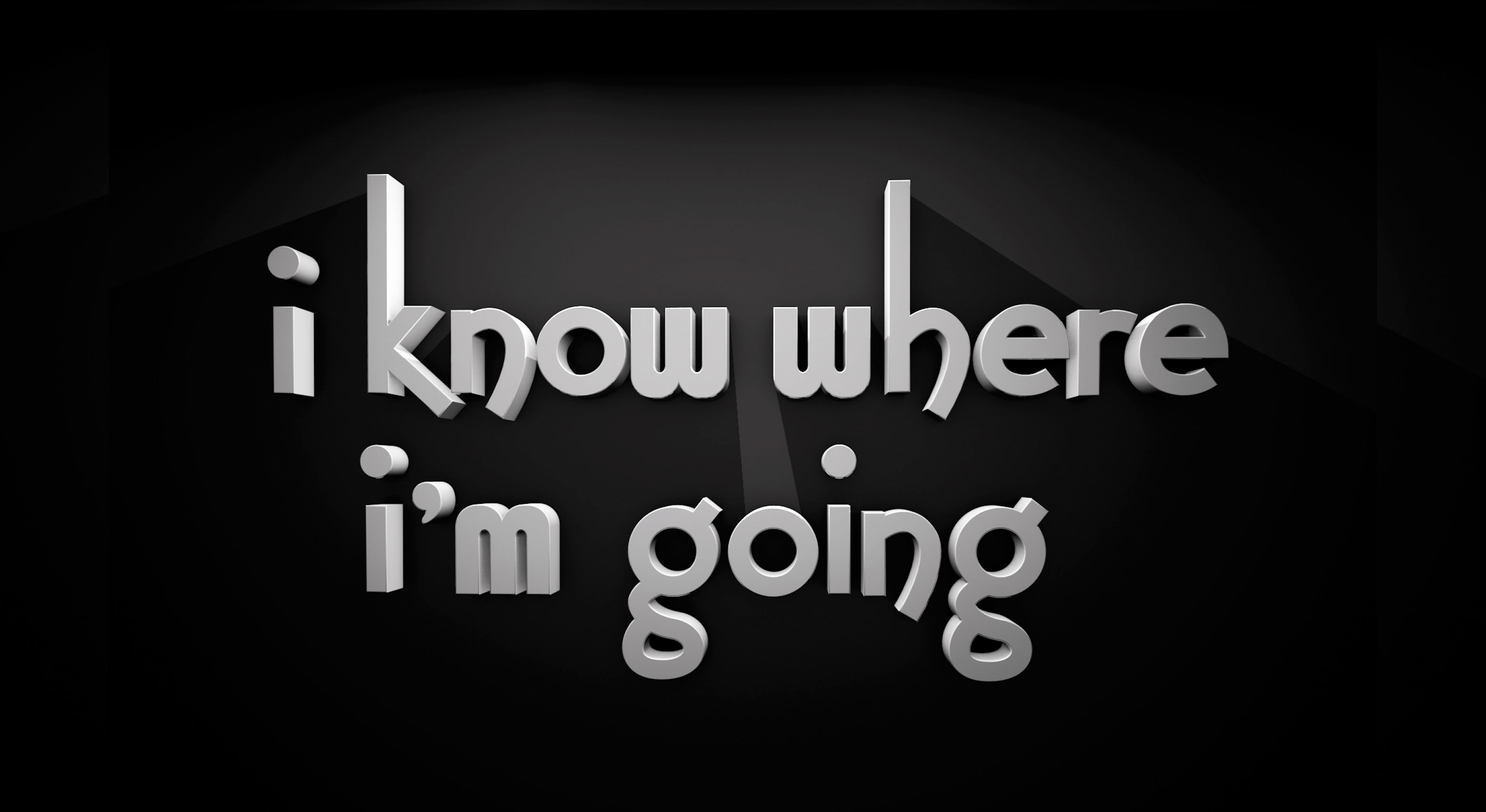
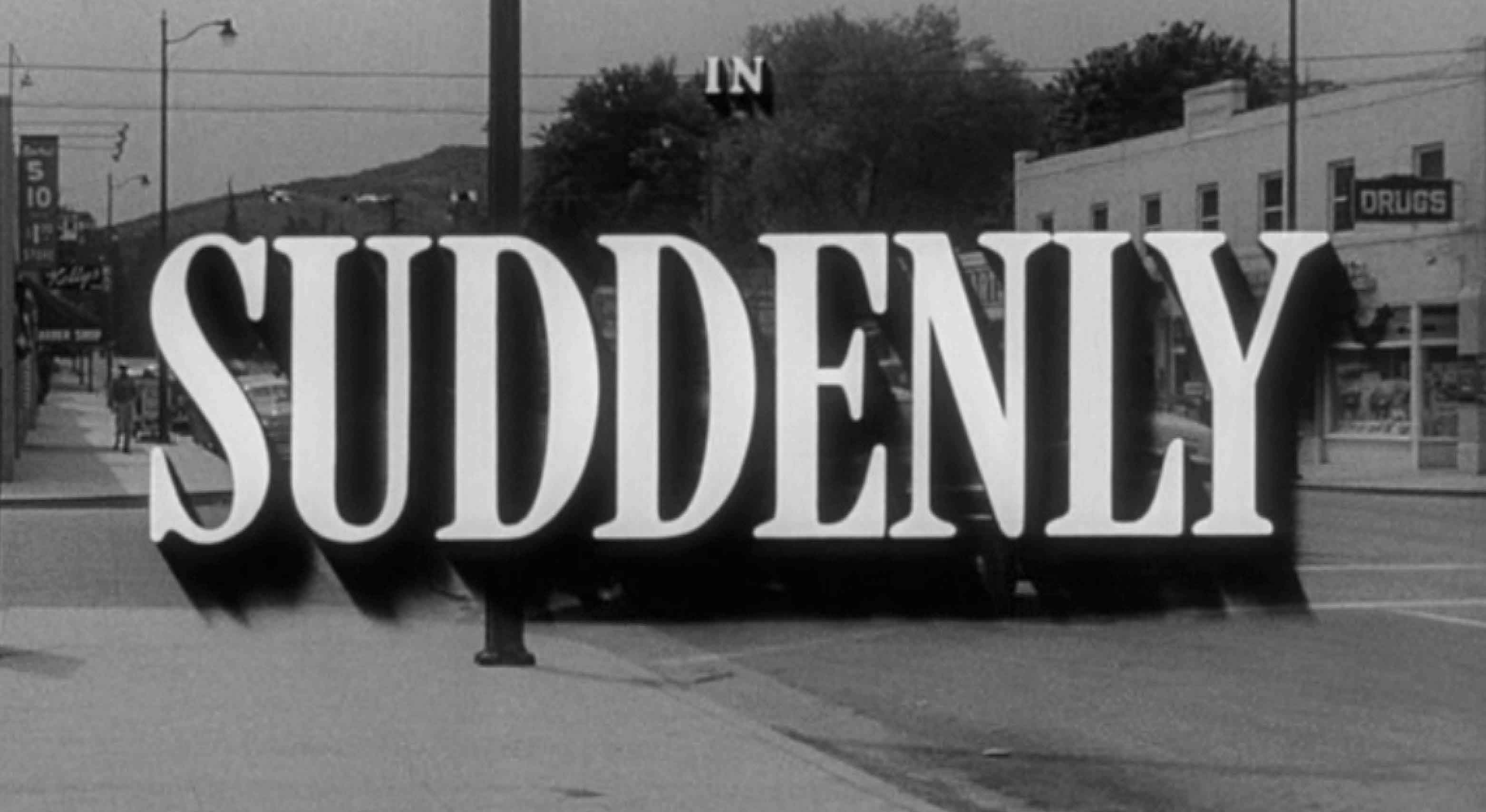
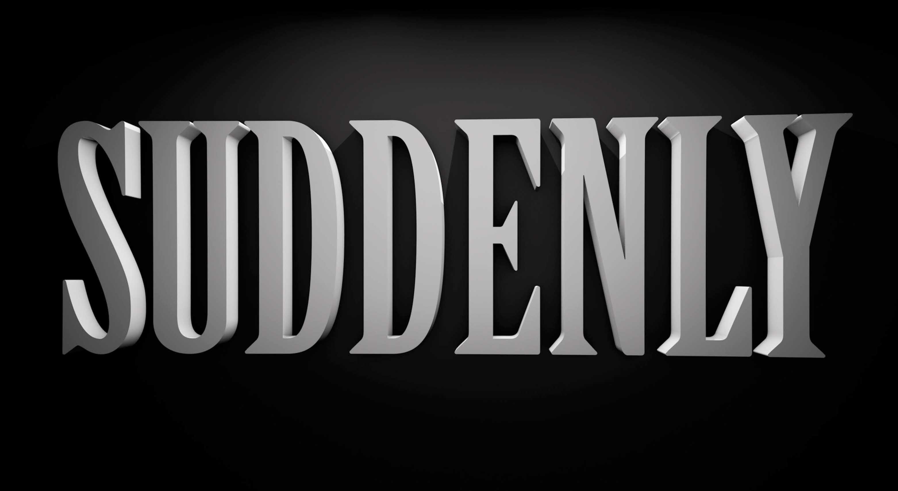
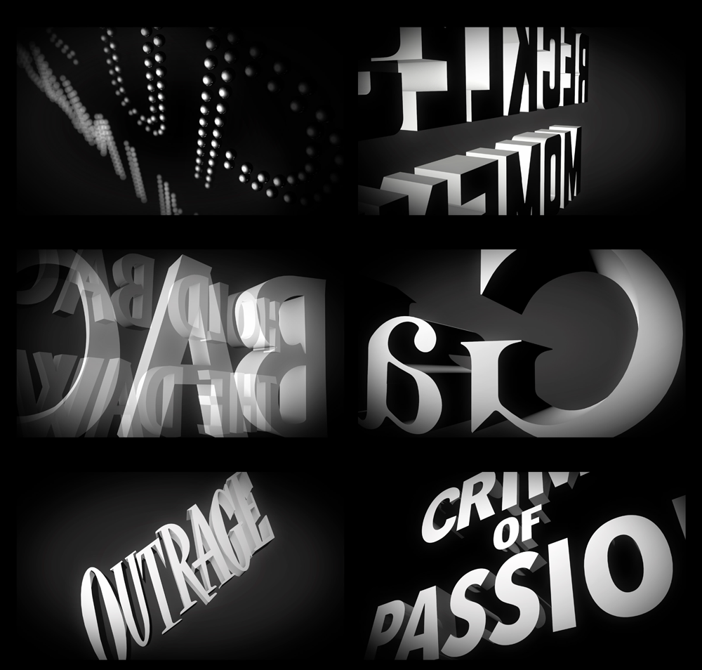
Titled is a tribute to classic film titles from 1920-60. Before title sequences became a moving art form, a title existed as static typography that spoke for itself. These older designs inspired me to tell a new cinematic story of my own, using 3D to bring life and dimension to historic work. I used movies from this era, and from different genres, to tell a Film Noir-esque story.
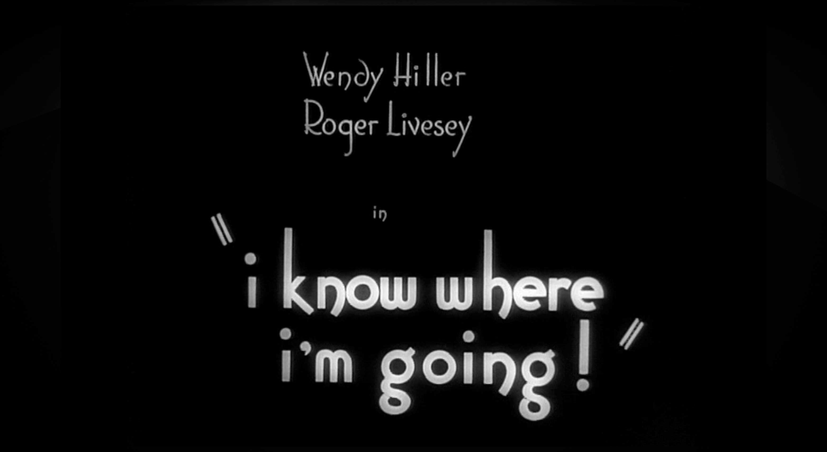
Titles used to exist as static typography, known as title cards. I had a chance to see some of these titles myself, projected onto a giant screen, and the sight of them was awe-inspiring. They had a distinct presence, unlike anything I had seen before. The style and treatment of these typographic forms inspired the creation of Titled. All of the titles you see in the video are actual titles from real movies.
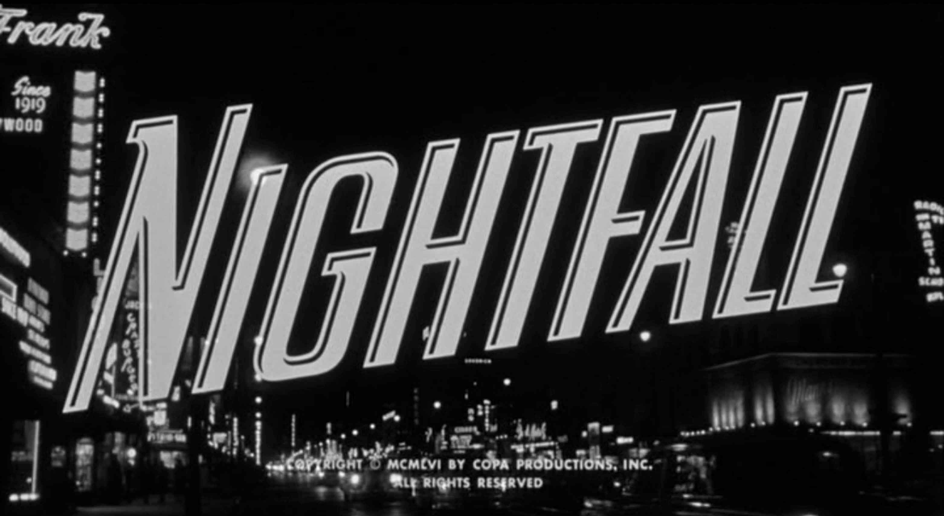
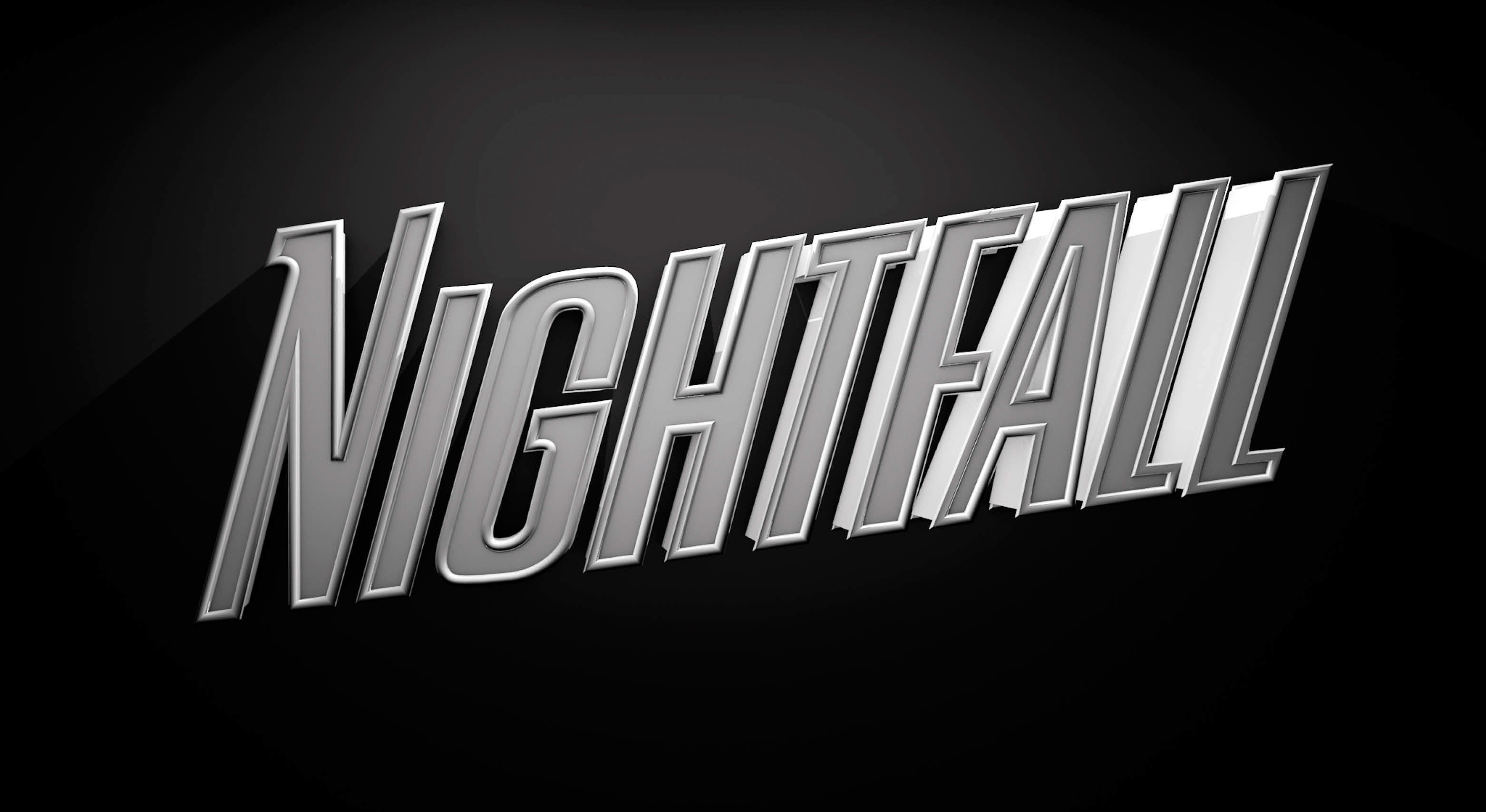
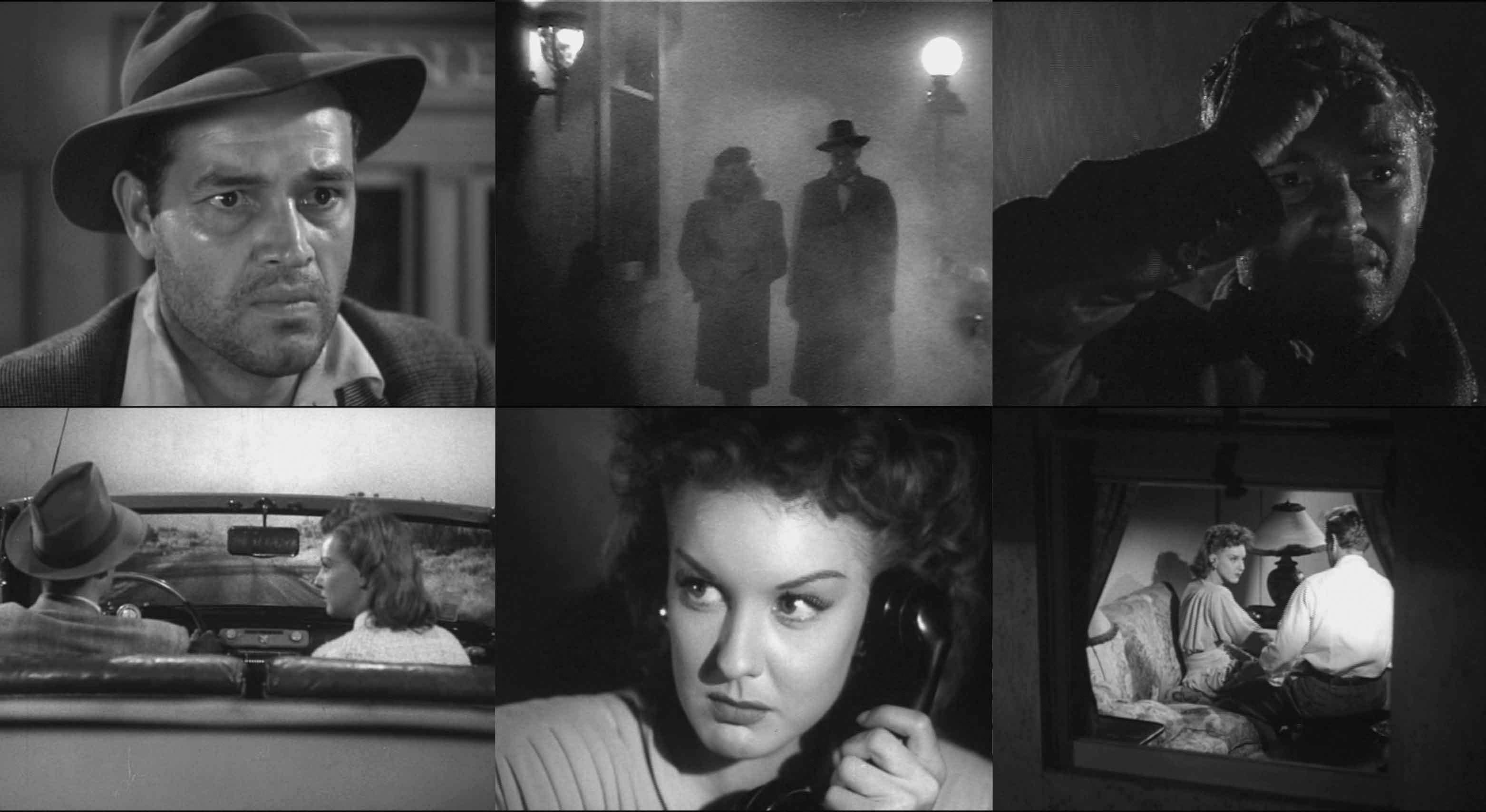
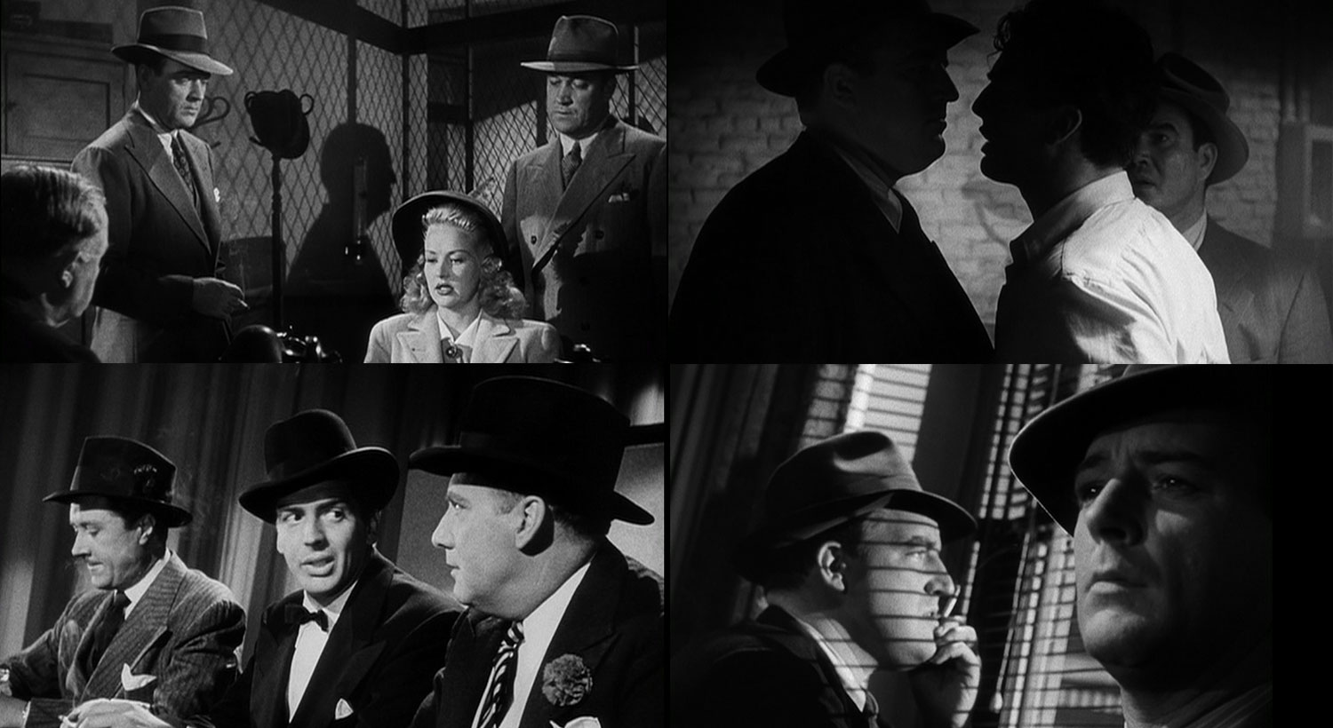
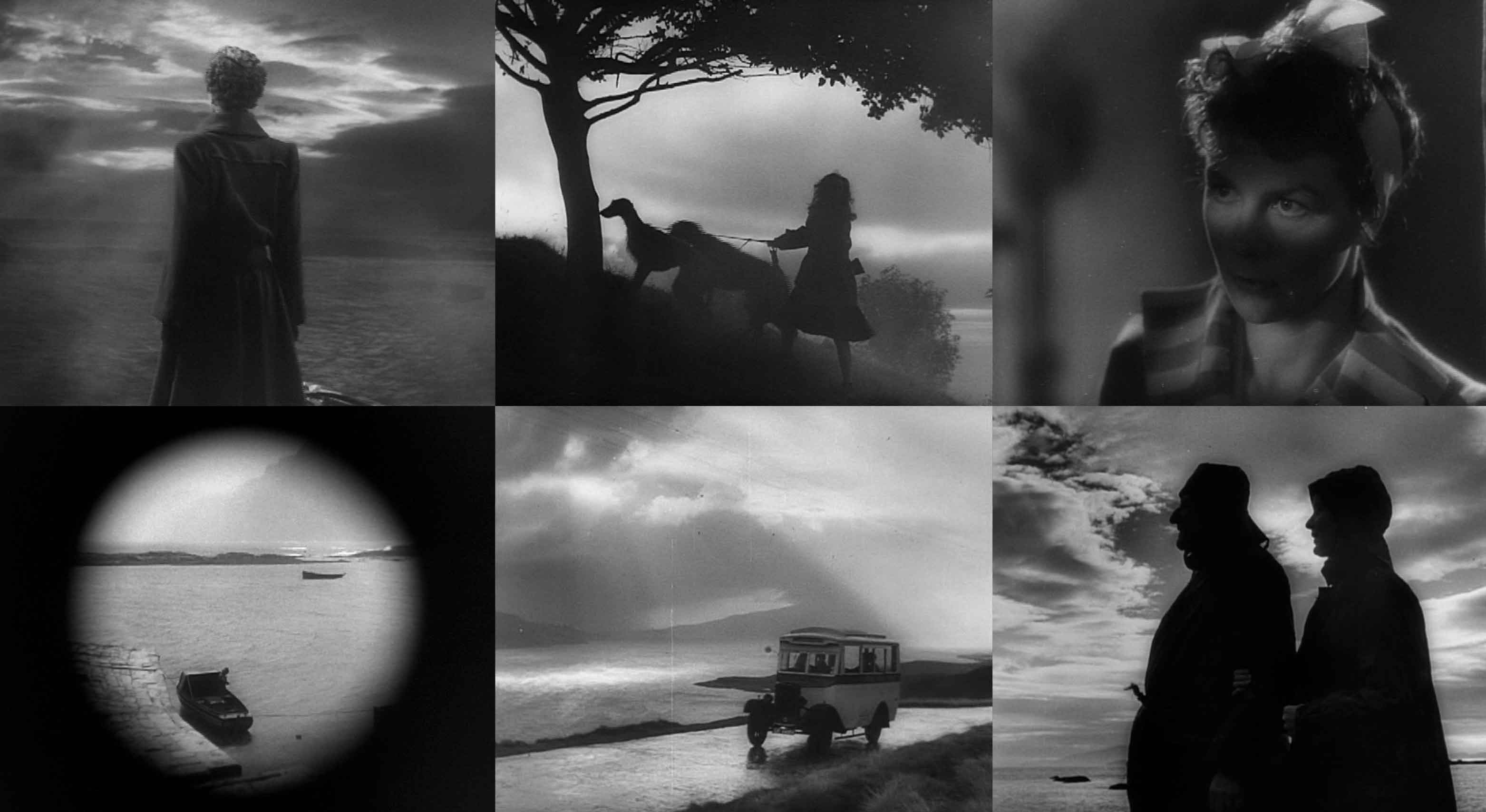
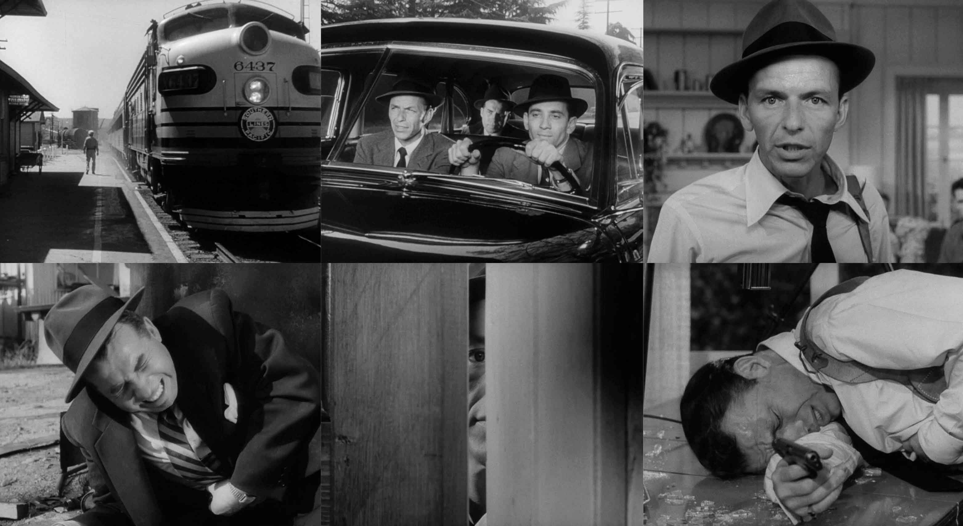
I chose movies from all different genres — crime, drama, romance — because these genres make up Film Noir films. I wanted to highlight the typography in the title design, but I also found inspiration from the style of these films. The light and shadows are beautiful and dramatic, they create a mood and bring the audience into the story. Below is a selection of some of the movies represented in the film.
Titled
An Homage to Title Design
Titled is a tribute to classic film titles from 1920-60. Before title sequences became a moving art form, a title existed as static typography that spoke for itself. These older designs inspired me to tell a new cinematic story of my own, using 3D to bring life and dimension to historic work. I used movies from this era, and from different genres, to tell a Film Noir-esque story.
Titles used to exist as static typography, known as title cards. I had a chance to see some of these titles myself, projected onto a giant screen, and the sight of them was awe-inspiring. They had a distinct presence, unlike anything I had seen before. The style and treatment of these typographic forms inspired the creation of Titled. All of the titles you see in the video are actual titles from real movies.
I chose movies from all different genres — crime, drama, romance — because these genres make up Film Noir films. I wanted to highlight the typography in the title design, but I also found inspiration from the style of these films. The light and shadows are beautiful and dramatic, they create a mood and bring the audience into the story. Below is a selection of some of the movies represented in the film.
SKILLS REQUIRED
Creative Direction
Conceptual Design
Script Writing
3D Modelling
Motion Design
Sound Design
Environmental Graphics
Installation
CREDITS
Designer & Director: Jamie Carusi
Voice: Sean Carusi
MICA Directors: Ellen Lupton, Jennifer Cole Philips
Thesis Advisors: Abbott Miller, Glen Cummings
PUBLICATION
Graphic Design the New Basics
Authors: Ellen Lupton,
Jennifer Cole Phillips
Princeton Architectural Press;
2 Edition | July 2015
MY ROLE
Creative Direction
Concept Design
Script Writing
3D Modelling
Motion Design
Sound Design
Environmental Graphics
Installation
CREDIT
Designer & Director: Jamie Carusi
Voice: Sean Carusi
MICA Directors: Ellen Lupton, Jennifer Cole Philips
Thesis Advisors: Abbott Miller, Glen Cummings
PUBLICATION
Graphic Design the New Basics Authors: Ellen Lupton,
Jennifer Cole Phillips
Princeton Architectural Press;
2 Edition | July 2015
DESIGN PROCESS
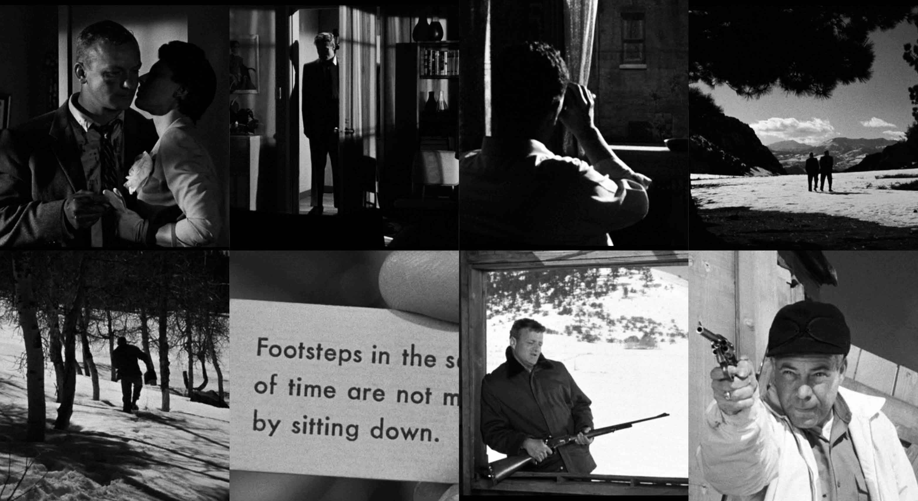
Using the titles from different movies, I stitched together a script that told its own noir story. I paid tribute to this historic style of title design by using the titles themselves to tell the tale.
Using the titles from different movies, I stitched together a script that told its own noir story. I paid tribute to this historic style of title design by using the titles themselves to tell the tale.
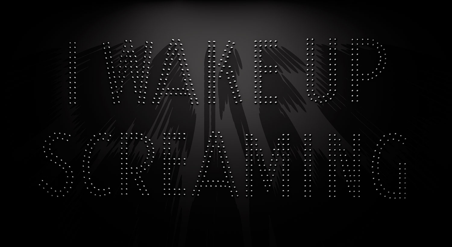
TITLED STORY
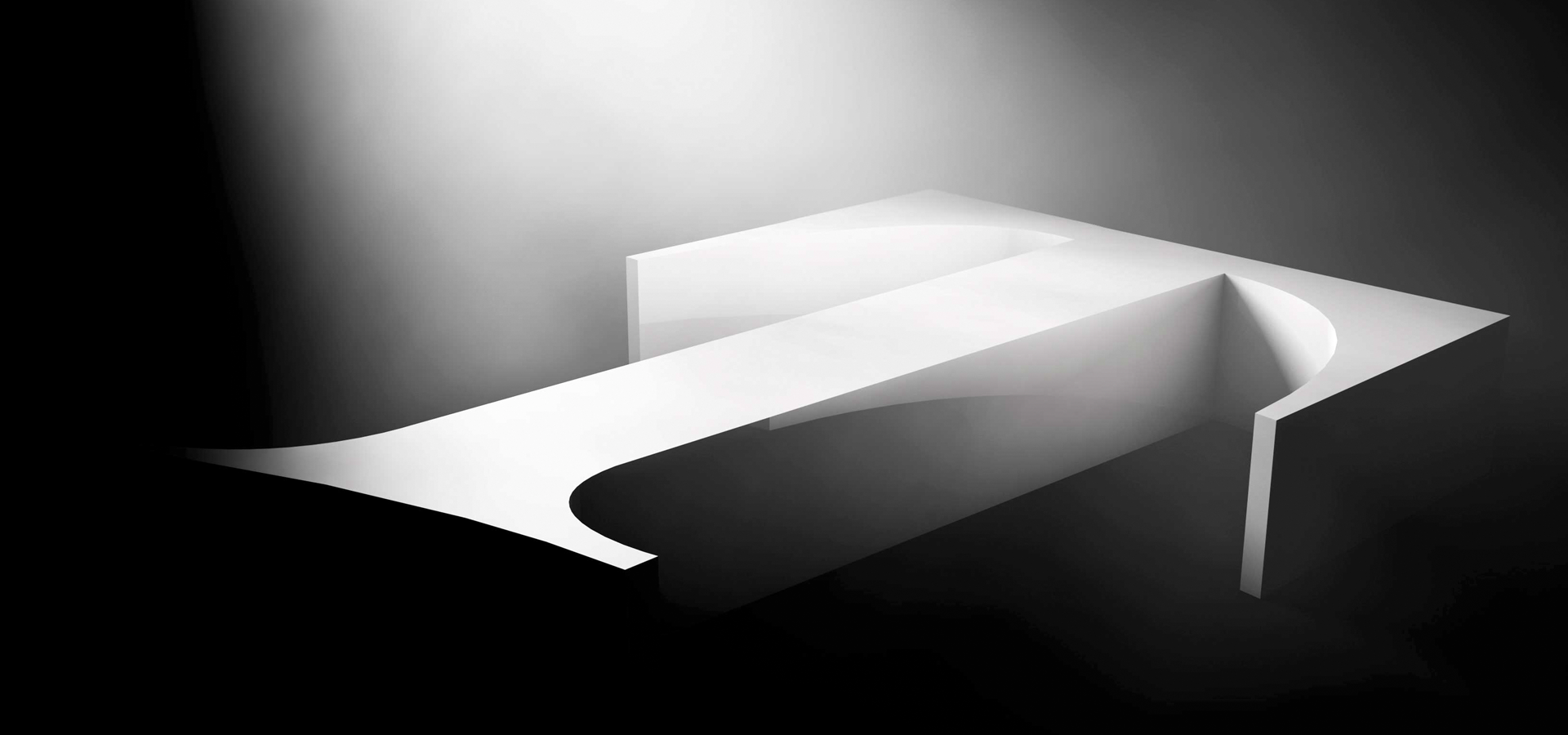
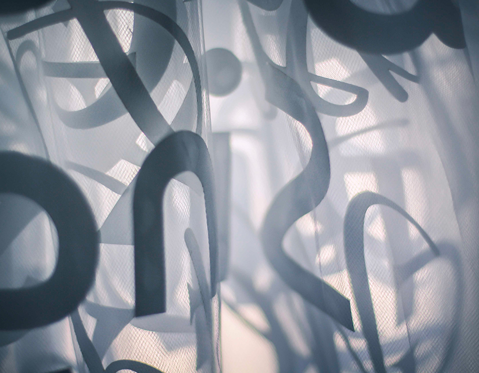
Taking cues from classic Film Noir, there is a single spotlight throughout the entire piece. The view and angle of the titles are indicative of what the narrator is going through. At the beginning of the story, the words are backward and distorted — just like the narrator — but as the story unfolds the words start to become legible and eventually find resolution while facing the light.
Taking cues from classic Film Noir, there is a single spotlight throughout the entire piece. The view and angle of the titles are indicative of what the narrator is going through. At the beginning of the story, the words are backward and distorted — just like the narrator — but as the story unfolds the words start to become legible and eventually find resolution while facing the light.
Because the video was projected into a corner, the perspective of the film changed depending on where you stood in the room.
Because the video was projected into a corner, the perspective of the film changed depending on where you stood in the room.
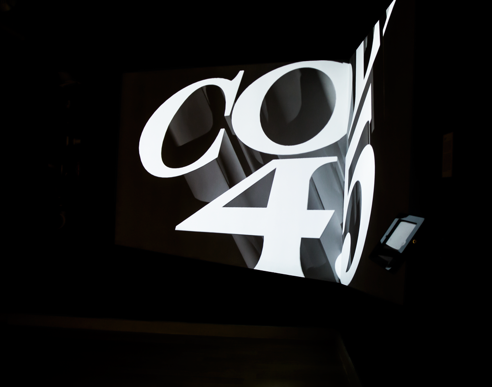
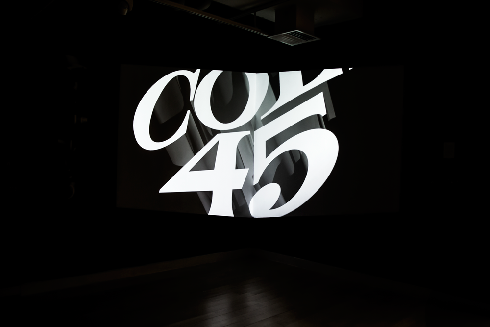
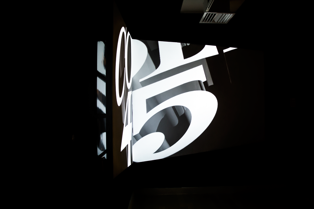
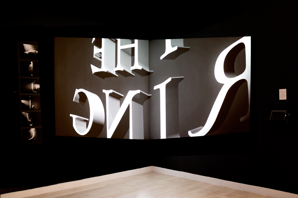
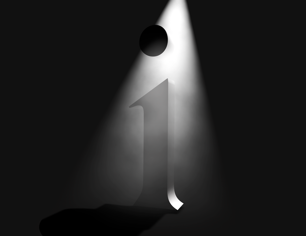
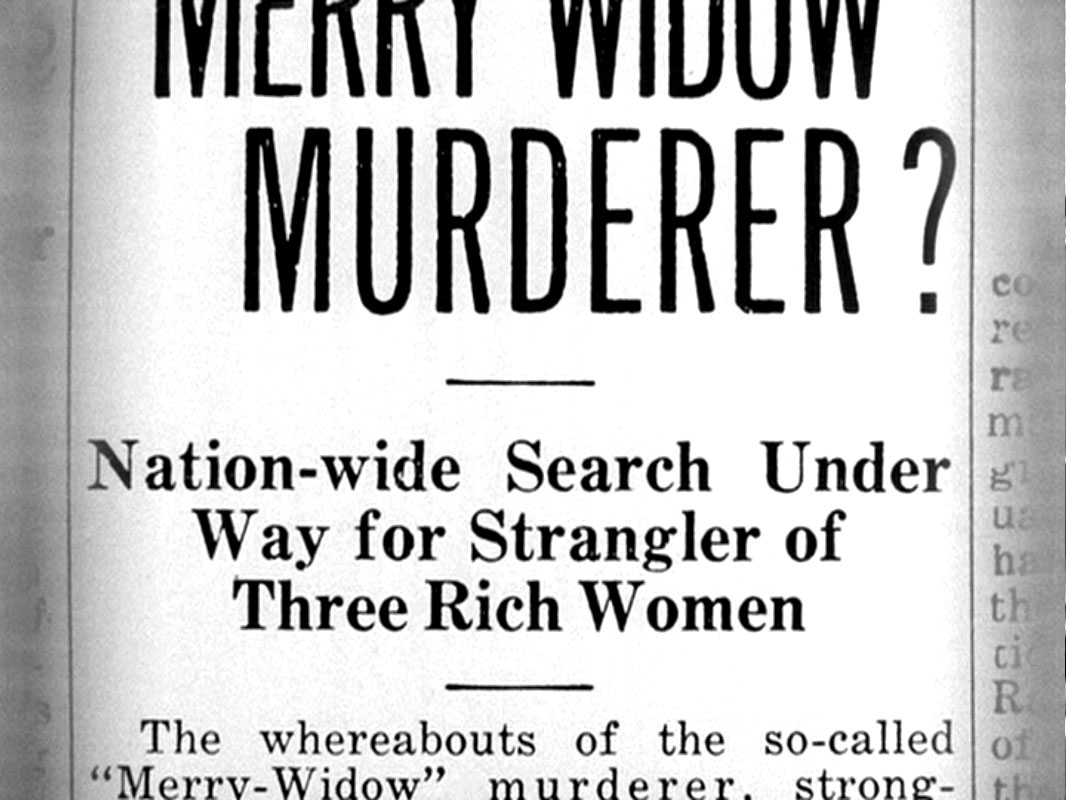
Image from Shadow of a Doubt, directed by Alfred Hitchcock, 1943.
Image from Shadow of a Doubt, directed by Alfred Hitchcock, 1943.
More Projects
AccuWeather + ReachTVRequires Password


World Economic Forum 2020Requires Password
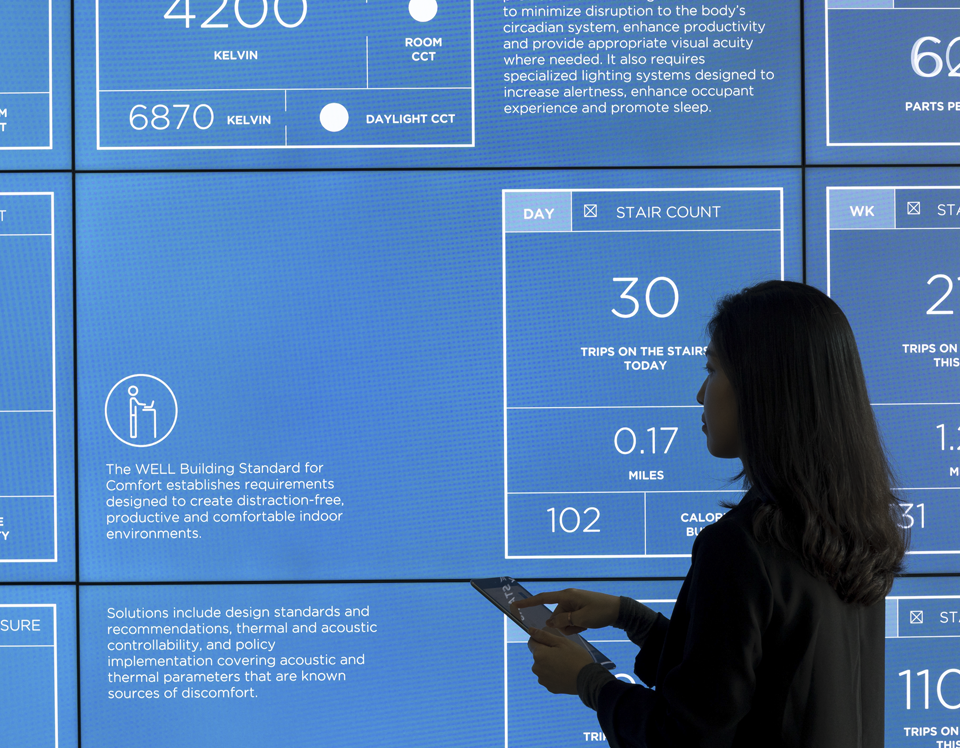
DelosRequires Password
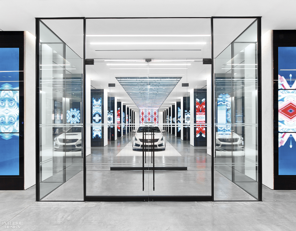
Cadillac HouseRequires Password
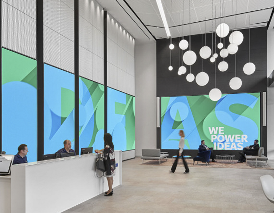
Allergan HQRequires Password

Mainstay Brand VideoRequires Password
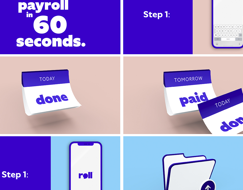
Roll App VideosRequires Password
NBA StoreRequires Password
ApertifPersonal
Museum MilanoPersonal
The WellProject type
Blend 3015Personal
Unveiling ExpectationsPersonal